

This blog post recounts how moving this site to a joyful responsive design with a lot of images had a very positive impact on visitor engagement. It then discusses which techniques are used to keep the site fast and lightweight despite its heavy use of images. I must confess: My site had huge design issues, but until 2014 I refused to see that there was a problem because I thought the design was slick and awesome (hint: it was not). Back in those days, the bounce rate of the site, which has around 20k visitors a month, was off the chart: 82% of visitors left after reading a single page. In hindsight, it is clear that my old design, visible in the screenshot below, was not appealing to visitors. It was very austere, had small images and in-your-face social icons.

Early in 2014, I faced up to the truth and decided to address this lackluster look by doing a full redesign instead of tinkering with the old design as I had been doing for a year. I restarted from scratch with the help of a designer. After many brainstorming sessions, we decided to go for a warm and joyful design that would help my visitors feel welcome. The most visible change between the two designs was to move from a mainly text-based site to a site that uses many large and colorful images to entice users to read more content. The other big change, which you cant see but can test by reloading with a different resolution, is that the new design is also fully reactive with images will almost perfectly adapt to any resolution.
Improving user experience and engagement
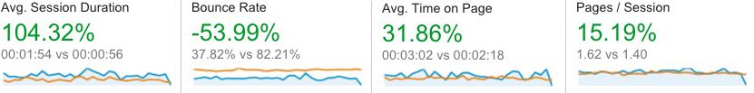
So, did this redesign work? Absolutely! Switching the design led to an improvement in every visitor metric. As visible in the screenshot above, which compares a full month before the launch (October 2014) with February 2016, the number of pages per session increased from 1.4 to 1.6. I think this positive change is likely due to having a greater number of appealing images on the related posts. Similarly, the bounce rate, which is the percentage of visitors who navigate away from the site after viewing only one page, dropped from 82.21% to 37.82%. This is a huge win as it means that now the vast majority of my visitors read at least two pages, whereas before only a meager 17.8% would do so. The other big win is that the new design, as visible in the chart above, led to a sharp increase in the time spent on each page by my visitors (31.86% increase). Which combined with people reading more pages led to having visitors spending twice more time on the site (104% increase in session duration). People are not only reading more pages but they also are spending twice as much time reading each page! This can be attributed to having a design focused on content legibility and the use of dynamic image scaling. For example, to make the site easy to read, I increased the font size to 16px, which is the optimal size according to research. All in all, while design cant replace content quality, coming up with the right design and paying attention to its usability really paid off for me.
The dark side of an engaging responsive design
While great for user engagement, getting the new design to load fast turned out to be a nightmare due to its heavy use of images and the use of images scaled on the server to make it fully reactive. The new design had two key performance issues: first, the number and size of requests per page drastically increased compared to the previous version because of the images. Secondly, using a large image as a header creates a terrible loading experience with a huge amount of whitespace in the middle of the screen before the image loaded. I tackled these performance issues with a threefold approach:
- I fixed the loading experience by using the frozen image technique.
- I made the site as light as possible by optimizing its resources.
- I got the content to load as fast and as smoothly as possible by optimizing delivery.
The rest of this blog post discusses in detail how each of those steps were implemented, and how much value they brought to the table.
Improving the loading experience

A key feature of the new design is the use of a large image as a header for each page as visible in the screenshot above. The drawback of this is that initially when a post was loading, visitors were seeing a huge square of white space. Initially, I tried to improve the experience by adding a loading bar, which was in line with the content of the page as visible in the screnshot below.
This in-line animated gif adds 6kB (uncompressed) to the page and clearly did not bring a whole lot of value. For over a year, while I knew it was not great, I kept this loader because I had no idea how to do it better.

Luckily for me, in December 2015 I stumbled upon the frozen image technique in a ccs-trick.comblog post. This is a much smarter way to deal with a placeholder for a large image header. The frozen image technique, invented by Facebookfor their mobile app, alleviates the header loading issue by inlining a very small and blurred version of the header image. It is stretched by the client and used as placeholder. This technique is called the frozen image technique because when stretched, the little blurred image looks like a frozen version of the image, as visible in the screenshot above. Once loaded, the full version of the header image fades in over the top of the frozen image, making a nice effect. You can test it by simply reloading this page. mplementation wise, I simplified the proposed approach by generating the frozen image directly on the server with the right size (42 x 42). The blur was also done on the server and the image was placed in line as a data URL. I simplified the fade-in by using only the z-index property, the opacity property, the requestFrameAnimation callback and a CSS3 animation. This ensures that the switch is both smooth and compatible with most browsers. As a bonus, not only does this technique provide a far better user experience, it also improves performance. The frozen image for this blog post is only 1.1kB (uncompressed), which is an 85% reduction in size compared to our old loading bar (6kB).
Making the site as light as possible
The second step in getting the site to load as fast as possible was to ensure that each asset was thoroughly optimized. Usually when people think about asset optimization, they think of minification. However, minifying JavaScript and CSS is only the beginning of asset optimization, and there are many other tricks that you can use. Here are the three that had the largest impact on performance for me:
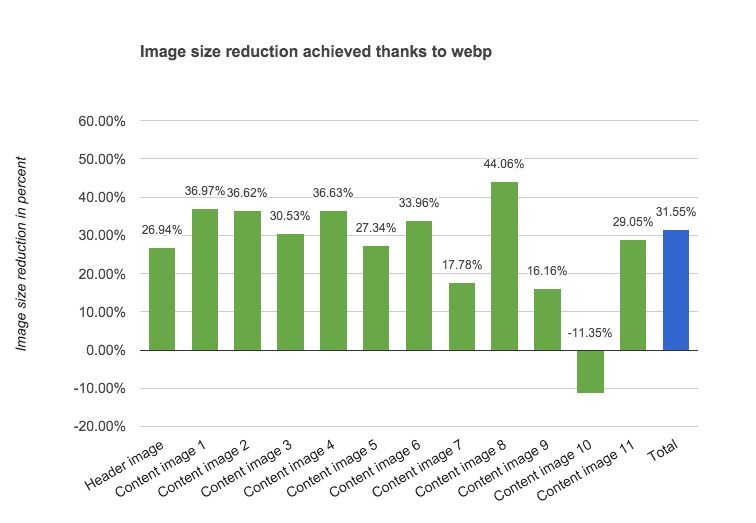
Better image compression with WebP: WebPis a recent image compression format that offers vastly superior performance compared to a JPG. Sadly, it is so far only supported by Chrome and Chrome Mobile. Firefox has had an open bug for over 3 years but it doesn’t seem to be moving :(. For example, for my poker blog post, as visible on the chart, the size of images decreases by 31% when WebP is used instead of JPGs (187.5kB vs 274kB). This is slightly better than the 26% performance reported in a previous study. Overall, I think it is realistic for most sites to expect at least a 25% reduction in terms of image size when implementing WebP.
If you are considering using WebP on your site, you will be pleased to learn that browsers make it very easy to know when to return a WebP image, as they advertise WebP support in the HTTP request “accept:“header.
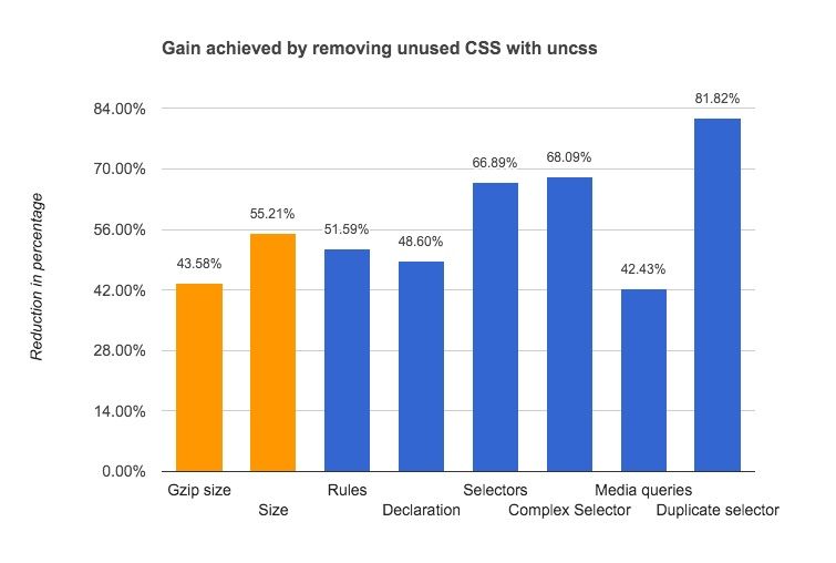
CSS cleanup: The site is built on top of Foundation 5 which means there was a lot of unused CSS shipped with it despite using the SASS version. This cruft was removed thanks to the integration of the grunt uncss plugin, which identified the unused CSS classes. The chart above, compiled using analyze-css, shows that removing useless CSS really paid off. The size of the CSS once compressed was almost halved, with a 43% size reduction. Decreasing the complexity of the CSS in terms of selectors (879 vs 2655), declarations (1877 vs 3652) and rules (730 vs 1508) also helps speed up the rendering, as the browser doesnt have to parse and evaluate useless CSS rules and selectors.
Minimal JavaScript: Instead of relying on JQuery for loading images and animation, the site relies on CSS animation and classie.js. This proved to be both lighter (4kB vs 32kB) and faster: up to 74% (even though performance is not an issue). Keeping the JavaScript footprint very small turned out to be essential, as I had to embed it in every page, as recounted in the next section.
Loading the content as quickly as possible
To make the site fully reactive, I took the route of generating the images on the fly. I did so on the server to the (almost) exact resolution requested by the browser. While great for delivering images perfectly optimized for the client resolution with an arbitrary image aspect ratio, this approach turned out to be an hindrance when trying to optimize the loading time because it requires JavaScript to load images. When a page loads, JavaScript is used to compute dynamically the width and the height that each image needs and then it sets the image src attributes of the image URL with the computed width and height as parameters. Setting the src (or background URL) is what triggers the load of the image.
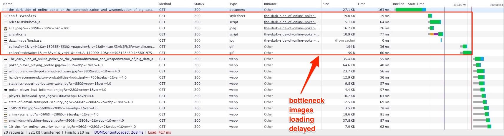
This approach creates a bottleneck because the width and height of elements are only available after the onload event. As a result, images can only start to load after the JavaScript and external CSS are loaded, as visible in the screenshot above. Note that I tried to use the onready() event to trigger the image loading faster but the image sizes are not populated in the DOM at that point. Hopefully in the future, client-side hints, when fully adopted, will allow us to do the same without the need for JavaScript.
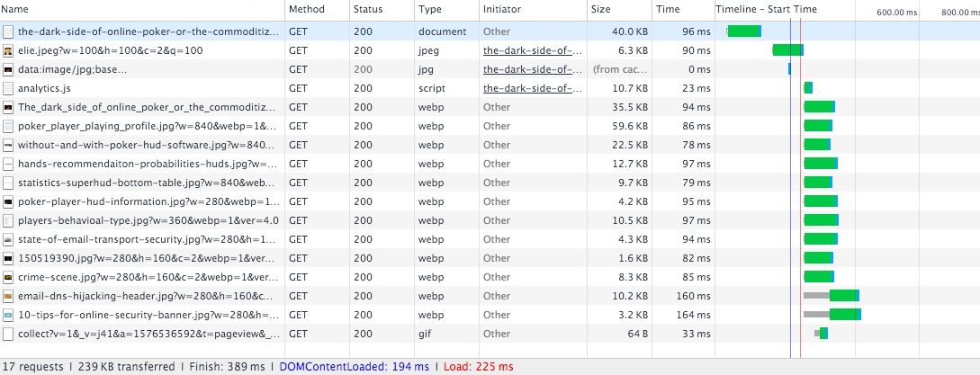
To fix this bottleneck, instead of simply inlining the critical CSS and deferring JavaScript, I ended up shipping all the CSS and the relevant JavaScript with the page. I also had to inject the Google Analytics script programmatically after the code for the images has executed to get the onload event triggered as fast as possible. With regard to the page size, this inlining is not as bad as it seems since the non-critical CSSis only 7kB uncompressed and the JavaScript only a few kilobytes. As visible on the screenshot above, with these modifications, images now start to load as soon as the document is parsed and the page loads in less than 250ms on a fast connection.
Ensuring smooth loading
While technically not a performance improvement, with all the CSS 3 animations, deferred loading and scrolling-based animation used, it was also important to optimize them to ensure a smooth experience. It turned out that optimizing the smoothness was easy but the techniques to do so are not as widely advertised as the loading optimizations, so I learned about these only recently. Basically, you need to do two things:
-
Use the requestFrameAnimation: When you need to change the CSS, dont do so directly, but ask the browser to do so when it can by using the requestFrameAnimationcallback. This ensures you wont have choppy animations since the browser does an optimization when your CSS change is executed. It also prevents your site from burning up your visitors CPU with needless CSS animation when they are looking at another tab. Implementing this change was easy. I simply modified classie to use the requestFrameAnimation for every CSS change and used a polyfill to ensure browser compatibility.
-
Debunk your onscroll event: I use a scrolling event to know when to load the images located at the bottom of the page and animate the email subscription popup (I hope you subscribed). Incorrectly using the onscroll event led to a choppy scroll (and horror stories), so I made sure to use the best practices suggested by Paul Lewis.
Was all this effort worth it?
So, was it worth it from the users point of view? The best way to answer this question is to look at how much faster a page loads visually, as this is what a visitor will perceive. Doing so is easy as 1-2-3 using the visual loading comparison feature of Webpagetest.org. The test was done by comparing the unoptimized version of the page with the optimized one, except WebP images, which are used in both cases.
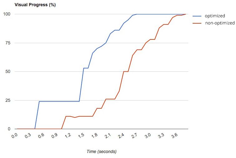
As visible on the screenshot above, it is clear that the optimizations paid off. The optimized version of the main page loads significantly faster than the unoptimized version. As visible, a good fraction of the visible page is available way sooner than the unoptimized one was.
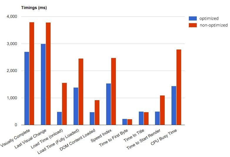
We can get a quantitative confirmation of the improvement by looking at the various page timings, which are also reported by WebPageTest. The timings depicted in the chart above show that the optimized version (in blue) clearly outperforms the unoptimized version. In particular, we see that the load time is roughly 75% faster, which is very good as our image loading depends on this. We also note that simplifying the CSS, using the requestFrameAnimation and simplifying the JavaScript reduced CPU usage by roughly 50%. All in all, the results show that the optimizations really paid off and that while each optimization does not seem that important, when combined they end up making a huge difference.